Securities America
Industry
Finance
B2C / B2B
Services
- Strategy
- Concept
- Design

Brief
Securities America is one of the largest broker/dealer financial corporations in North America. Their primary focus is on financial planning.
After being acquired by Ameriprise, they came to us because their website was outdated and had grown to a point where the amount of information presented overwhelmed users.
My Role
Web Developer / Art Director
Deliverables
Wireframes
UI mockups
UI components
Project
Website & Microsite Redesign
Early Explorations

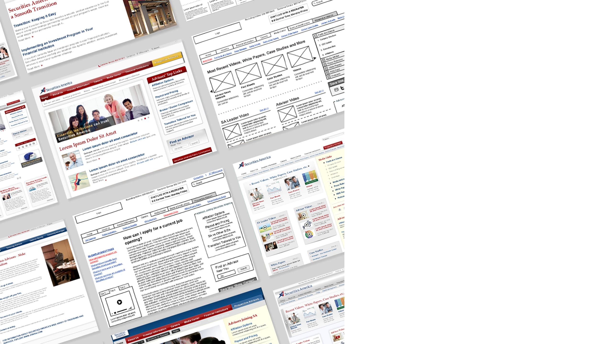
Wireframes & mockups
Don't Sweat the Technique
As with all projects, I made many alterative versions before we all settled on a final design. The difference with this project in particular, was that the original site was so extensive - having hundreds, if not thousands, of pages.
Since this was such a huge redesign, it was imperative that we determine the structure, layout, and main objectives of the site from early stages. Working with a committee of stakeholders, we agreed on three rounds of wireframes and two rounds of mockups.

Accessibility
Readable to all users
Due to the demographic of Security America's user group, we focused on making the site easy to read for those with low vision or visual impairments. We enhanced the typography for clarity and used clear visuals to communicate messages. We also tested colors to ensure good contrast for users who prefer a "dark mode" on their devices.
Additional steps we had taken to comply with accessibility standards are:
Descriptive alt text values are assigned to all images
Ensuring a minimum 4.5:1 color ratio for all text
Using descriptive text links and headers
Maintaining a consistent and predictable layout
Eliminating all potentially distracting elements like pop ups and auto-playing media.
Testing to ensure our site is navigable by keyboard or screenreader only
Presenting information in a hierarchical and meaningful order
Providing a focus indicator for all active components of the website
Adding captions to video

Final Mockups
UI Elements


