Walt Disney
World Resorts
Industry
Travel - B2C
Services
- Strategy
- Concept
- Design

Brief
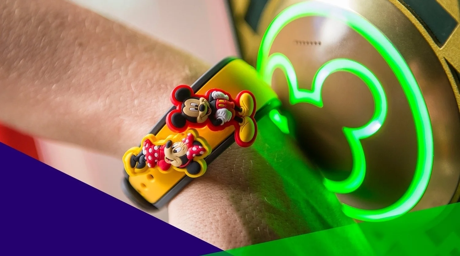
We were informed by Disney World Resorts that they were launching a new campaign, "Plan a Dream Vacation," promoting discounts and benefits using their FastPass+ cards for the upcoming summer break. Conversion was to be delivered with measurable results in page views and Twitter impressions.
My Role
Sr UI Designer
Deliverables
Banner ads
web & print collateral
UI mockups
Project
Digital Campaign
01 / discover

The Challenge
Our team had to discover the greatest benefits of Disney's campaign for it's users and which areas of the Education.com site would be the most useful for implementation. We also had to see where our products align and discern how our company could leverage our own offerings to further promote Disney's initiatives.
Begin the beguine
Doing some detective work
 n the initial stage, our team approached the campaign from two angles. Our Marketing/SEO team investigated page views and relevant key word searches on our site. I was in charge of the logistics of the front-end and design stage of the process. My first step was to study Disney's campaign and their sites, evaluate how their products could fit with our pages and our own ongoing campaigns, and retrieve any assets I would need to create designs.
Gathering Design Assets from Disney sites
I visited the Disney Parks and Resorts sites and many of Disney's other sites that fell under their umbrella - Disney Family, Oh My Disney, etc. I went into the source code for those sites to attain anything I would need to create mockups. From the code, I was able to find information about their styles and layout and retrieve images that I would later use for creating banner ads, booklets, hero images and the like.

Behind "PLAN a dream vacation"
Upon further conversations and analyses of Disney's site, our team determined that Disney's promotion of their FastPass+ was really just part of a bigger initiative to drive their audience to use the My Disney Experience side of their site. This microsite helps users plan and organize their trips in order to make the visit as fun and efficient as possible. This was a key insight because we had many pages that involved trip planning, which would fit very well with Disney's campaign.
Styling "The DREAM"
While studying Disney's source codes, I noticed that the images they were using for their current campaigns were styled to looked like photographs (like you were capturing invaluable memories). And in the usual Disney fashion, they used a lot of images of stars evocative of dreams and fantasy. I later used that information when I was making the designs above.
02 / define

The devil's in the details
Right, Ursula?
(- I'm talk'n to the sea witch, of course.)
Ascertained the nature of the campaign and it's goals
Acquired necessary assets and noted Disney's style
Next on the list, figure out where our offerings intersect.
We're not too shabby ourselves.
The World of Brainzy
 imilar to Disney, we have fantasy lands filled with magical creatures in which our audience can become immersed. While the kids are having fun getting to know our characters and exploring this mysterious terrain, we're sneaking in some learn'n at the same time too!
They love us.
They really love us!
Over 15M people, mostly parents and teachers from all over the world, have signed up as Education.com members. 10K new members join every day.
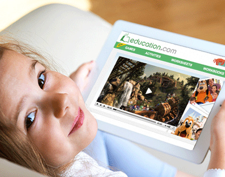
As a learning resource hub for millions of free and paid subscribers, Education.com had exactly the target demographic Disney World Resorts was hoping to reach.
The Goods
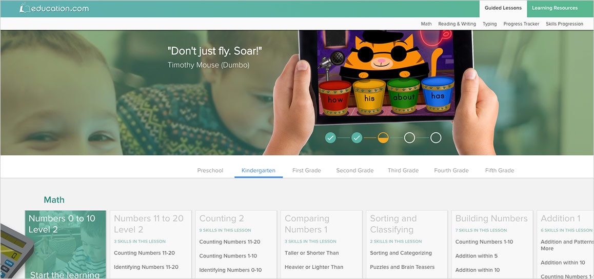
Education.com offers a vast array of educational tools
Educational games and videos
Workbooks and worksheets
Lesson plans
Assessment tests
Disney also offers similar kinds of products for their user base - games, videos, activities, etc. While games would be too complex implement into our site, we could easily host many of their other products.
Leveraging existing content and code
Bibbidi bobbidi boo
 pon examining Disney's sites and their many offerings, it became very clear that we had many similar products and services for our users. With this in mind, there were many different avenues for us to pursue.
- 1
With regards to SEO and keywords, we could target our most popular pages relevant to Disney's campaign and use those pages' prominence for placement of Disney's ads.
- 2
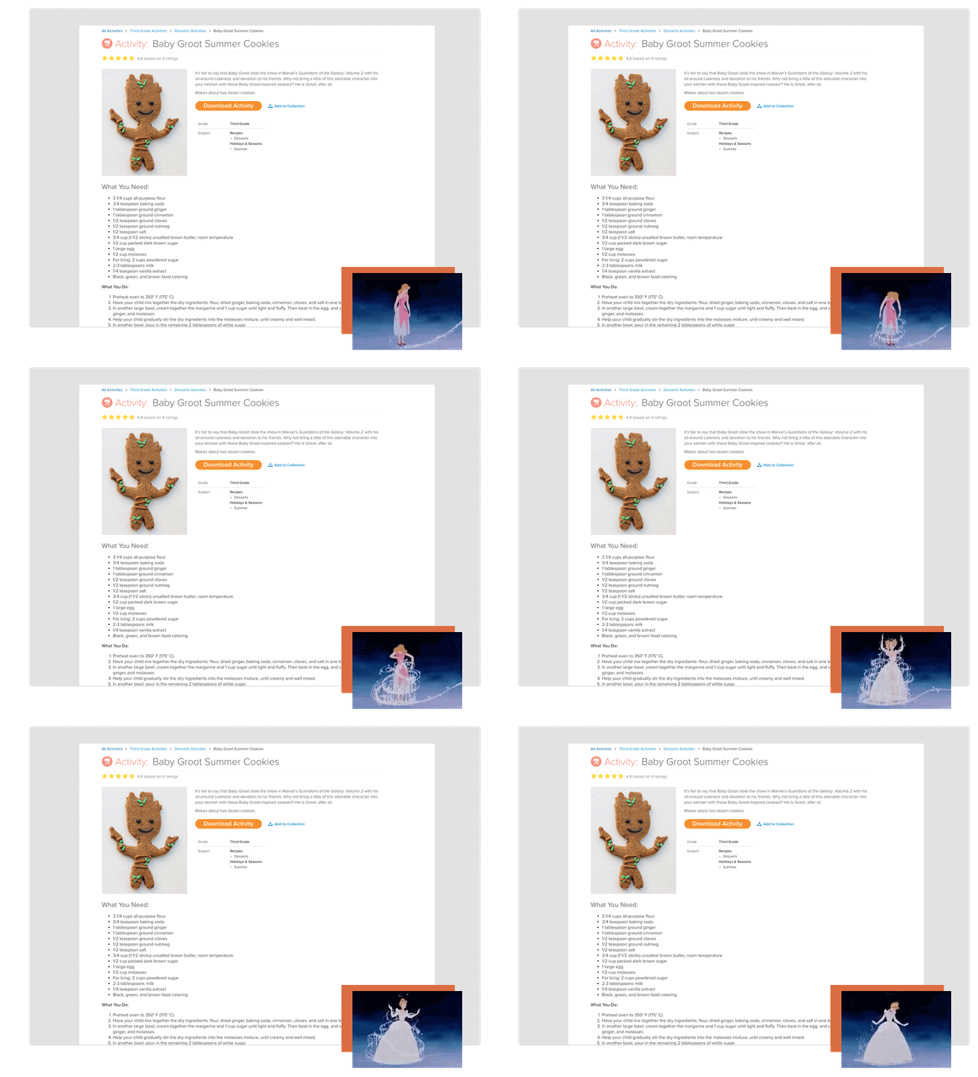
We could create new Disney sponsored products - workbooks, worksheets, articles, etc.
- 3
We could create new dedicated pages (using our existing pages as a base) for all things Disney and Disney adjacent.
Spoiler alert: We did all three.
03 / design

Creating the moment
Our objective was to create experiences for our users. We wanted Disney's content to reawaken that sense of wonder and leave it's audience wanting more.
Inception, baby
Planting the seeds
Very often, parents will visit Education.com to attain learning resources for their children. The site is great because there are thousands of different resources from which parents can choose and they can search for them by category, keyword, or theme.
We showed Disney that for users who exhibit an inkling of interest toward spending a summer vacation somewhere warm, we could display Disney ads on their search pages and provide related learning resources that were relevant to the campaign. Even if the thought was just a twinkle in their eyes, we could begin to stoke the fire.
Fostering goodwill
Inspire and encourage
 bove all, Education.com strives to provide thousands of free learning resources to parents and teachers to help kids grow. The materials that are sometimes restricted to paid subscriptions are made available for limited periods of time through sponsors. During these periods, sponsors' ads and content are given top priority so that our subscribers will know the source of these invaluable materials.
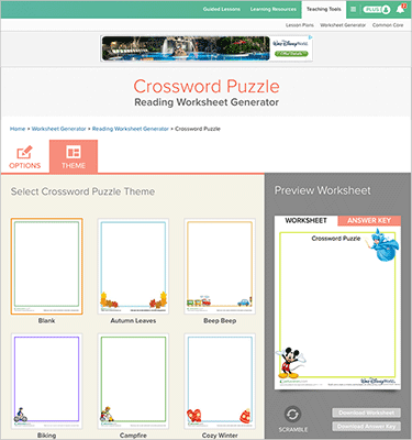
The Worksheet Generator allows users to create their own worksheets. They can create anything from sudoku puzzles to crossword puzzles and word searches to help kids prepare for their spelling tests.
Sometimes, we fail
But what matters is getting up and brushing it off
 embers with a paid subscription, who didn't see ads, could still benefit from that Disney magic in various ways. First, for several months, we proposed having a Disney theme to our site. There could be Disney dedicated pages, in which everything on the page was related somehow to Disney or the campaign. And we could provide inspirational Disney quotes on pages in which children were attempting to learn new skills.
Anytime, Anywhere
Fully responsive website
 e showed Disney that our audience can access the site from any device. The kids can play games on their phones, parents can save articles to read at a later time, and teachers can even access their lesson plans and assign students homework while they're on their morning commutes.
Sprint to the finishing line
Once the campaign launched, we had three months to provide our audience with a rich, personalized user experience promoting summer vacations at Disney World Resorts.
Coffee's for closers
Happy client. Happily ever after.
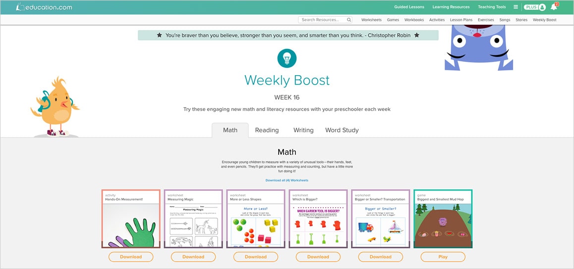
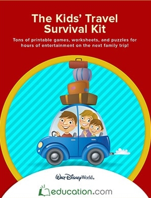
 ithin our site, we targeted content specific pages with key words such as Disney, cartoons, and travel and displayed Disney ads. We created branded web and print materials - including games, articles and booklets. We gave access to parts of the site, that were only available for paid subscribers, to all visitors and made it clear that those pages were sponsored by Disney. Then, we also created solely Disney dedicated pages, in which every bit of content on the page was relevant to Disney's campaign. Since the launch, Disney World Resorts has approached us for similar offerings for Spring and Winter breaks.
Our biggest flex.
Results
21M TWITTER IMPRESSIONS GENERATED ORGANICALLY
30 000 VIEWS OF THE COMMERCIAL IN 15 DAYS


