Industry
Travel - B2C
Services
- Strategy
- Concept
- Design

Brief
Education.com's shop page had low visibility, leading to confusion over online subscriptions versus physical items. The design limitations affected scaling and product presentation. We needed a new strategy to improve visibility and showcase a wider variety of products.
My Role
Sr UI Designer
Deliverables
Banner ads
web & print collateral
UI mockups
Project
Site Redesign
Pain Points
Dated design
No clear indication as to what page the user has landed on
Limited ability to show off as many products as possible
Low engagement
The title of the page and calls to action didn't really intimate that we were offering an ecommerce store
Goals
An up-to-date design that looks fresh and clean
Clear and concise user flows
Scalable in order to showcase innumerable products from countless partners
Easy to find information that is tailored for each user
Search Engine Optimization
Good ROI
UI mockups needed
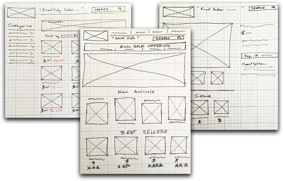
Shop Home page - which showcases newest products and deals
Category Page - which allows the user to shop by category and use filters
Detail Page
which enables a closer look at the product and views from multiple angles
gives product description and user reviews
shows similar items
Old Shop Design
Wireframes
From left to right: Category page, Shop Home page, Detail Page
Solution
Our dedicated team decided to undertake a comprehensive redesign of the shop page for a large e-commerce site that could effectively showcase countless brands and a diverse array of products. In addition to this, the prominently featured sale of the week would be highlighted in the main hero image, located at the top left of the page for optimal visibility. To maximize the reach and impact of this promotion, the main hero sale image was also recycled for use across various social media platforms and email templates, further amplifying the message of the sale and engaging a wider audience. Lastly, the Learning Store was put on the menu, thus gaining more visibility.
I created wireframes (using Balsamiq,) high fidelity mockups with Photoshop, and prototypes using Adobe XD. After all the pages of the Learning Store were developed, I created the designs for each weekly promotion, along with their corresponding images for social media and emails.
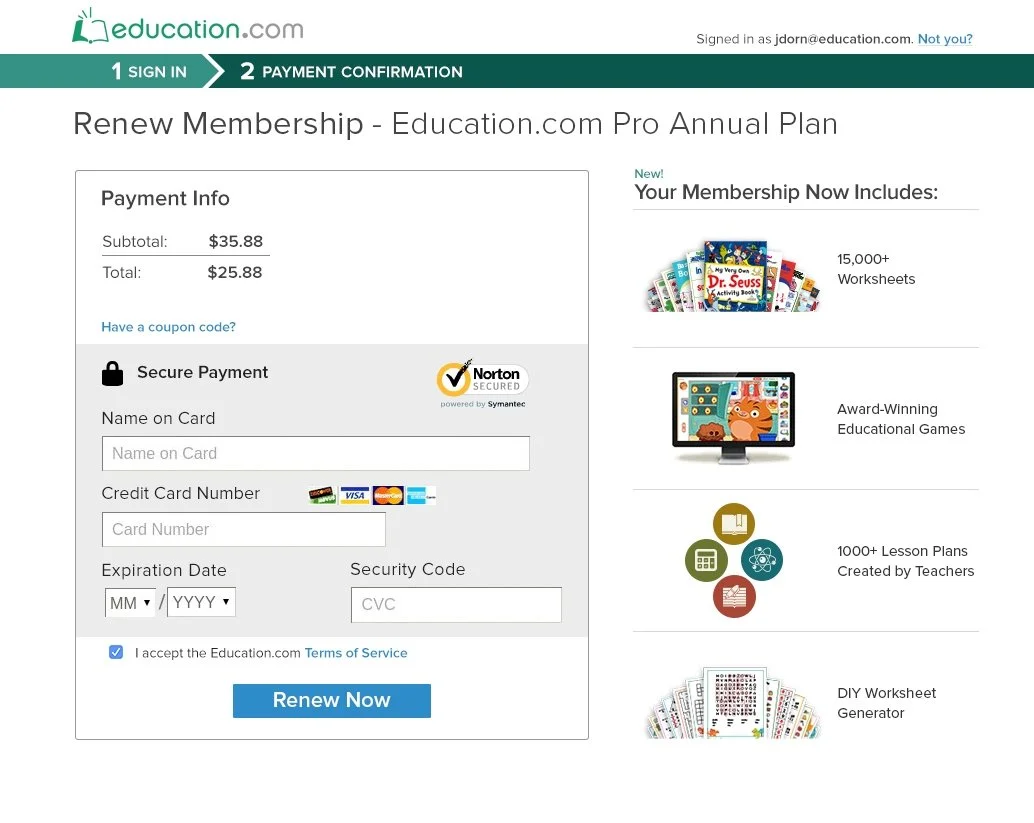
Revamped Purchase Pages
After user testing, our team agreed to update the purchase process. I designed the following two-step buy flow that shows the user's current step and presents the value proposition next to the Payment box. Research indicated that Western users, who read left to right, had the best conversion rates when the Payment box was on the left and the value proposition was presented on the right side.
Email template reflecting weekly sale
Learning Store (later renamed as The Shop) on mobile device
Outcomes
The redesign of the new Shop page was a huge success, exceeding expectations in several areas. The new layout allowed for countless products to be displayed more efficiently and effectively than before. While the old Shop design served primarily as a basic landing page, the transition to a more comprehensive shop design significantly drove conversion rates and enhanced user experience. As a result, one of our best-selling products, which consisted of various workbooks, sold by the millions, demonstrating the positive impact of this redesign on our overall sales performance.
Total Views
Since launching, the new Shop garnered over a hundred million views without any media spend.
in 2 hours
After a successful promotion on TikTok, the Shop's branded workbooks quickly sold out online.
increase
After the launch of the new Shop pages, organic web traffic significantly boosted compared to previous brand launches.


