Stella & Dot
Education
Fashion
B2C / B2B
Services
- Design

Brief
As a worldwide education platform, Education.com was a fast growing company. However, the About Us, About Our Company, Careers pages were not reflecting that growth. The style was a bit outdated and the user experience between pages was clunky.
It was imperative that those pages look as pristine and modern as possible in order to give our subscribers confidence in the company as well as recruit talent to fill our ever increasing needs.
My Role
Sr UI Designer
Deliverables
Retouched profile images
Webpage Copy
UI mockups
Project
UI Redesign
Year
2016
The Challenge
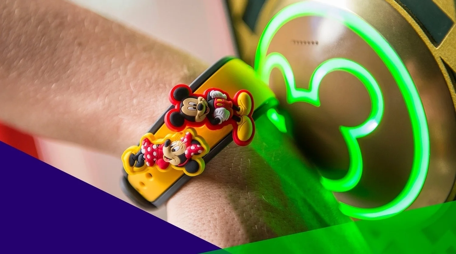
Our team had to discover the greatest benefits of Disney's campaign for it's users and which areas of the Education.com site would be the most useful for implementation. We also had to see where our products align and discern how our company could leverage our own offerings to further promote Disney's initiatives.
Begin the beguine
Doing some detective work
 n the initial stage, our team approached the campaign from two angles. Our Marketing/SEO team investigated page views and relevant key word searches on our site. I was in charge of the logistics of the front-end and design stage of the process. My first step was to study Disney's campaign and their sites, evaluate how their products could fit with our pages and our own ongoing campaigns, and retrieve any assets I would need to create designs.
Fostering goodwill
Inspire and encourage
 bove all, Education.com strives to provide thousands of free learning resources to parents and teachers to help kids grow. The materials that are sometimes restricted to paid subscriptions are made available for limited periods of time through sponsors. During these periods, sponsors' ads and content are given top priority so that our subscribers will know the source of these invaluable materials.

The Worksheet Generator allows users to create their own worksheets. They can create anything from sudoku puzzles to crossword puzzles and word searches to help kids prepare for their spelling tests.


