Accessibility
Readable to all users
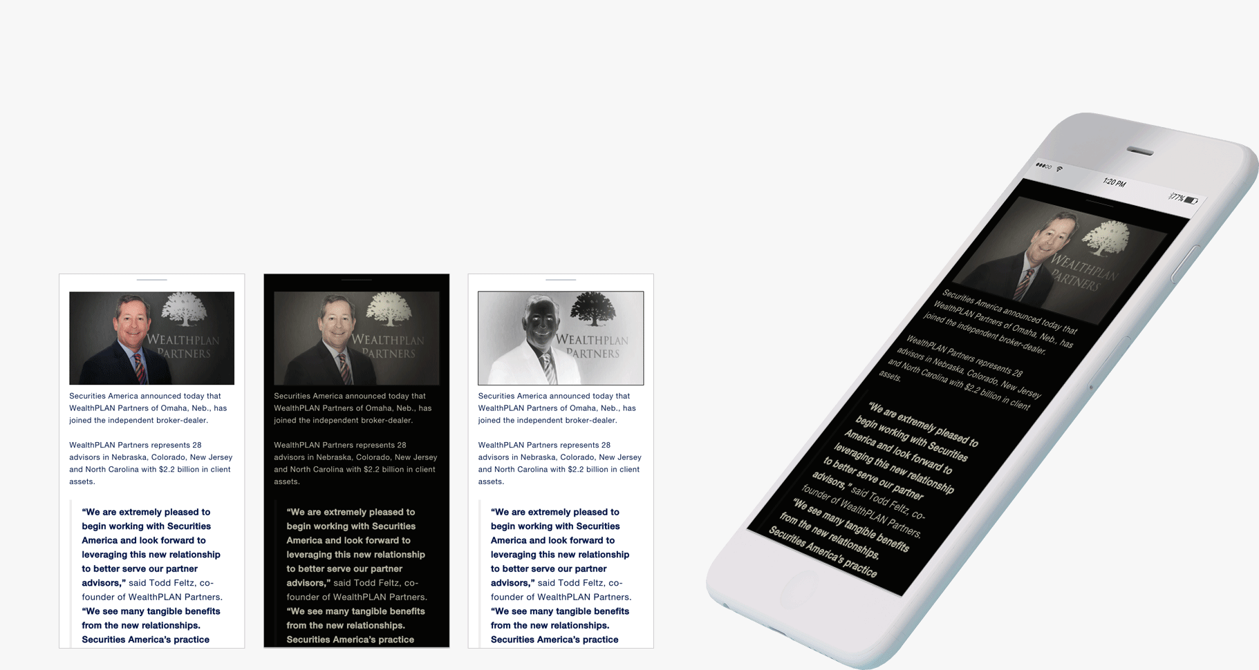
Because of the demographic of Security America's user group, we were particularly mindful that the site was as legible as possible for users with low vision or visually impaired. We put in a little extra work to make sure that there was clear hierarchy in typography (including dynamic type) and very informative visuals to convey messaging. We also tested to ensure enough contrast between colors in case users wanted to use a "dark mode" on their devices.
